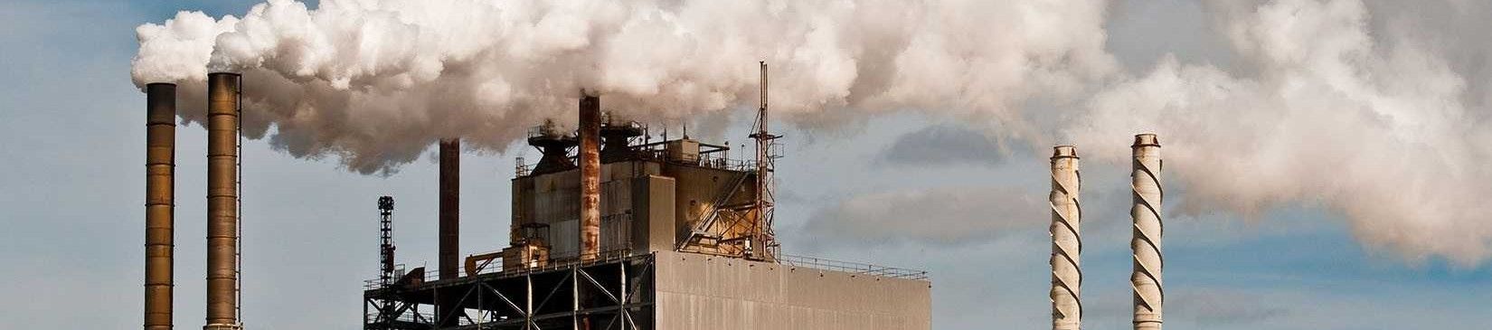
This page provides an analysis of CO₂ emissions data, presented through graphs and insights.
The dataset was created by The Global Carbon Project (GCP) and obtained via zenodo.org.
All files used are stored here.
Over the years, global CO₂ emissions have shown significant variations due to industrialization, energy consumption, and environmental policies. The following animated plot illustrates the global emission changes of every emission source type since past 100 years (click on play):
Coal remains the largest source of CO₂ emissions, followed by oil and gas. Emissions from coal climbed steeply between 2001 and 2014, then plateaued in the years that followed.
Notably, none of the emission sources shows a sustained decline; at best, some have stabilized. Such a flat trend is insufficient if we hope to achieve the reductions required under the Paris Agreement.
Between 2012 and 2022, global CO₂ emissions remained largely unchanged, with the notable exception of those from natural gas, which rose significantly. This increase reflects government initiatives to shift electricity generation away from coal toward cleaner alternatives like natural gas, with the aim of reducing net CO₂ emissions. This is also represented in the abrupt stagnation of coal emissions.
Not all countries contribute to CO₂ emissions equally. Historically, the United States has released the largest total volume of carbon dioxide, with China in second place. India, ranked seventh and with 4 times the population of USA (1.4 billion vs 332 millions in 2021), have only one-seventh of USA's emissions. This gap is explained by factors as industralization, life-style, wealth, electrical production sources, etc. However, it's important to notice the huge impact of the total emissions from USA and China over the rest of the world.
From the previous charts, we observe the following: